How to Keep AI-Generated UI Consistent: A Practical Design System for Coding Agents
The new page works. The form submits. The typography looks deliberate. Yet put it next to the rest of the product and it feels as if it belongs to another website.
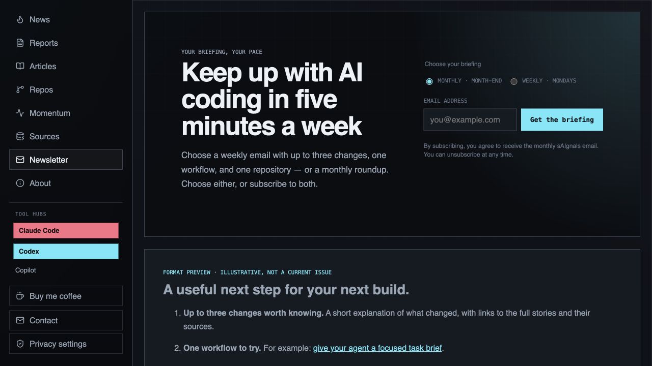
That was our problem with the sAIgnals newsletter page. The first version used the site's dark colors and fonts, but its oversized hero, generous spacing, and separate benefit cards gave it a different rhythm from News and Articles. Asking for a more polished page had produced a locally plausible result. It had not made the product more coherent.
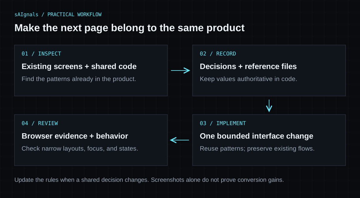
This guide shows the correction we made on November 1, 2026: identify the existing patterns, record them in a small design document, connect that document to repository instructions, and verify the result in a browser. It is a case study of one interface change, not a model comparison or evidence that the redesign increased signups.
A reusable design-system document and UI review checklist are available at the end. The workflow is intended for coding agents working in an existing repository, regardless of which assistant you use.
Start with the neighboring pages
Before asking an agent to implement a screen, choose two or three existing views that represent the product well. Name their source files and inspect their rendered output. A component can contain the right class names while still producing an awkward layout at a particular width.
For sAIgnals, the useful references were the News and Articles pages, the shared navigation, and the global stylesheet. They established a compact page heading, restrained surfaces, thin borders, technical labels, and content arranged in rows or purposeful panels.
The newsletter already shared the palette. The mismatch was in hierarchy and composition: a headline up to 54 pixels, a padded promotional hero, and repeated explanations spread over several sections. A different accent color would not have solved that.
Give the agent a bounded investigation before the edit:
Inspect the target page and two representative neighboring pages.
Read the shared stylesheet and the components those views use.

List:
- existing tokens and reusable components;
- differences in hierarchy, spacing, and interaction;
- the smallest changes that would make this page fit.

Cite the relevant files and selectors. Treat existing accessibility
problems as defects to fix, not patterns to copy.
This produces an implementation brief grounded in the repository. For a broader approach to choosing task context, see our context engineering guide.
Give code, design rules, and task instructions different jobs
A design document is most useful when it explains decisions the stylesheet cannot express on its own.
| Location | What belongs there | Example |
|---|---|---|
| Styles and components | Values and executable behavior | Surface tokens, heading classes, form states |
| Design document | Meaning and usage rules | When to use a panel, how ordinary pages begin |
| Repository instructions | A short pointer and working expectations | Read the design document before UI changes |
| Task brief | The specific change and its acceptance criteria | Restyle the newsletter while preserving signup behavior |
Our document lives at docs/design-system.md. The exact filename is a project convention; creating a file with that name does not automatically make every assistant read it. Put an explicit pointer in the instruction mechanism your environment uses, and verify that the agent actually inspected it.
In our repository we added this rule to AGENTS.md:
For website UI changes, read and follow docs/design-system.md.
Reuse existing style tokens and shared page patterns. Update the
document when intentionally changing a shared design rule, and
verify both desktop and mobile layouts.
Keep the pointer short. Repeating the whole document in several instruction files creates more places for rules to diverge. Tools have their own loading and scoping rules; for example, Claude Code documents how project instructions and imports are loaded . Check your environment instead of assuming one filename behaves identically everywhere. Our repository-instructions guide covers that distinction in more detail.
Write rules that resolve real choices
“Make it modern and consistent” leaves almost every implementation decision open. A useful rule identifies a choice and gives the agent a way to settle it.
For this site, the document records:
- Page hierarchy: ordinary views start with the existing
.view-headingpattern. A large hero needs a reason tied to the page's role. - Surfaces: reuse the dark panel and border tokens. Keep corners square by default; avoid adding a new glow or shadow system for one view.
- Typography: use the existing sans-serif family for reading and monospace for short labels, metadata, and technical markers.
- Composition: use separated rows for a sequence of content; use a panel to group a distinct task or object.
- Interactions: preserve visible labels, keyboard focus, native input behavior, and loading, success, and error messages.
- Responsive behavior: account for the sidebar's width and test real content before deciding where columns collapse.
These are sAIgnals decisions, not universal rules for good design. A consumer storefront or a playful game may need a different visual language. Extract the rules from the product you are extending.
Keep token values authoritative in code
The design document can explain that cyan means a primary action or active choice. The stylesheet should remain the source of the actual color value. CSS custom properties let declarations refer to shared values with var(); they do not decide when a color is appropriate.
For example, these are existing sAIgnals values:
:root {
  --panel: #10141b;
  --line-strong: #394252;
  --text: #edf2f7;
  --muted: #9aa7b7;
  --cyan: #67e8f9;
}
Do not paste a second, slightly different palette into a page component. If a document includes a token table for readability, update it when the underlying tokens intentionally change. A reference to a source file is easier to maintain than a duplicated catalog of every CSS declaration.
The newsletter change: what we actually did
We replaced the promotional hero with the same page-heading pattern used by ordinary content views. The signup and preview now sit beside each other on a wide screen, with a single-column layout when space is limited.
The signup panel groups one task: choose a frequency, enter an address, and request the briefing. Its monthly and weekly options retain native radio inputs, with a more visible selected state. The form still defaults to monthly.
The preview is a numbered sequence: changes worth knowing, one workflow to try, and one repository to explore. Each row has a relevant link. Delivery and subscription-control details sit in a compact footer instead of another set of benefit cards.
The functional component was reused. This edit changed the page composition and styles; it did not replace the subscription endpoint, confirmation flow, or analytics events. Page-specific form styles were scoped under .newsletter-page, so the homepage signup did not inherit the larger frequency controls.
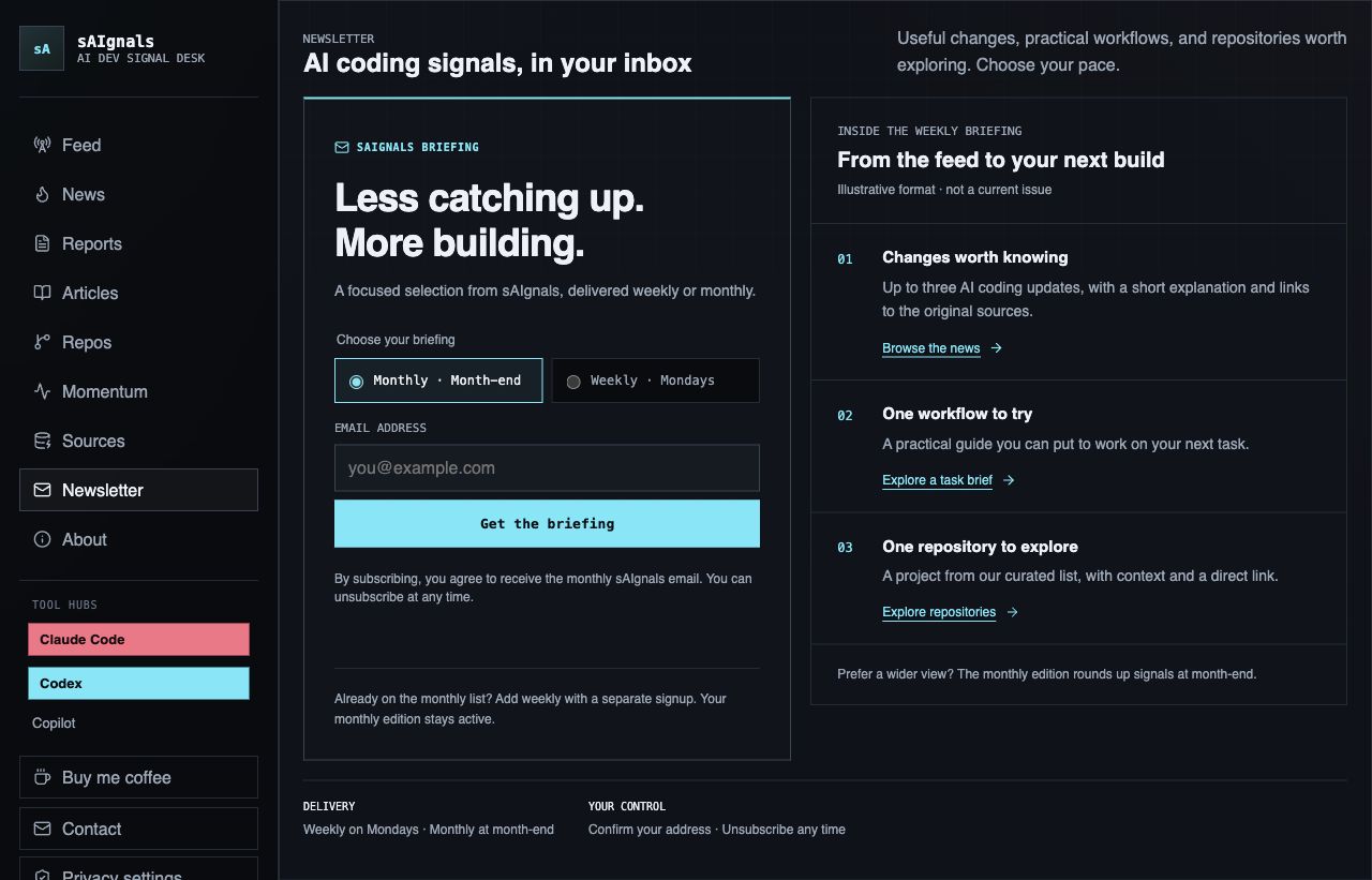
Both screenshots show a 1280-pixel viewport width; the before image is a shorter capture. The improvement is visible in the shared hierarchy and patterns. It is not a conversion result. To assess signups, we would need a defined observation period, comparable traffic, and confirmed-subscription data. A small before-and-after comparison alone would not establish that the design caused a change in conversion.
Turn the rules into a bounded implementation request
After agreeing on the direction, give the agent a concrete target and the evidence you expect back:
Update the newsletter page to follow docs/design-system.md.
First read that file, the shared styles, and the Articles/News headers.

Reuse the shared page heading and existing signup component.
Group signup as one task and preview content as numbered rows.
Preserve submission, validation, confirmation, and analytics behavior.
Scope page-specific styles so other signup placements are unaffected.

Check wide and narrow layouts, including 320 px. Verify the frequency
choice with keyboard input and inspect visible focus and form labels.
Run the relevant existing tests and the build.

Report changed files, verified states, and checks not performed.
Do not claim improved conversion or full accessibility compliance
from screenshots or passing tests.
This prompt gives the agent room to solve layout details while keeping product behavior and review evidence explicit. Add the real constraints of your project: localized strings, a supported browser matrix, a component library, or a screenshot comparison process. Leave out requirements that do not apply.
Verify appearance and behavior separately
For our newsletter change, we checked desktop at 1280 pixels and narrow layouts at 390 and 320 pixels. At the two narrow widths, the document did not overflow horizontally. We switched frequency with the keyboard, checked that the selected option and consent text changed together, ran the build, and passed 30 existing newsletter tests.
Those checks have limits. The newsletter tests cover existing backend behavior; they do not prove the new layout is accessible. A screenshot does not establish screen-reader usability or contrast compliance. We did not perform a complete accessibility audit or a conversion experiment for this change.
For your own UI review, include:
- Layout: compare against the reference pages; inspect long labels, real content, zoom, and narrow screens.
- Keyboard: follow the focus order, operate controls, and confirm that focus stays visible.
- States: inspect loading, success, failure, and validation states using controlled fixtures or a test environment.
- Contrast: measure foreground/background pairs instead of trusting a token name. WCAG's text-contrast guidance specifies 4.5:1 for ordinary text and 3:1 for large text, with defined exceptions.
- Targets: use comfortable control sizes. Our document sets a local 44-pixel height target for primary buttons and fields. That is a project convention, not a statement that WCAG 2.2 AA universally requires 44 pixels: its minimum target-size criterion uses 24 by 24 CSS pixels with exceptions, including spacing and inline targets.
- Regression: check shared placements, preserved behavior, and relevant tests before deployment.
When a shared style changes, inspect another consumer of that style. When the change is page-specific, keep the selector local. This reduces the chance that polishing one form changes another form elsewhere in the product.
Keep the document small enough to use
A design document should evolve with reviewed product decisions. Update it when the team intentionally changes a shared rule. Do not add every one-off exception as a permanent instruction for future screens.
If the document and a component disagree, investigate which reflects the current decision. Then fix the stale reference or the implementation. Silently following whichever file was read last makes drift harder to see.
You do not need to build a component library before improving one page. Start with the tokens and patterns already present. Extract a shared component when repeated implementations make that useful; a document should not become an excuse for a speculative refactor.
Take the workflow into your repository
Download the starter below, replace its placeholders with real files and decisions, and apply it to one page that currently feels out of place. The file includes a document skeleton, an instruction-file pointer, and a review checklist. Keep that first change small enough to compare with neighboring views.
The goal is a repeatable review: an agent can explain which existing rules it followed, a reviewer can inspect the result, and the next page can reuse the same decisions.